How to make your brand look premium on social media
"Why doesn't my brand look as premium as it is?"
You have made something good. The formulation is considered, the packaging is beautiful, the price reflects the quality. Then someone finds you on Instagram and the feed tells a different story: mixed fonts, inconsistent photos, a grid that looks thrown together. In three seconds, the gap between what you charge and what you look like does real damage.
This is the perceived-value problem, and it is one of the most fixable things in a small brand's marketing. Looking premium is not about spending more. It is about consistency, restraint, and taste, none of which require a big budget, all of which require care and a system. Get it right and your social starts justifying your price instead of undercutting it. And it holds whether you sell a product or a service: a studio, clinic, or coaching practice can look ordinary or high-end for exactly the same reasons.
This guide breaks down exactly what makes a brand look premium on social, and how to build it. It is long, so use the summary to jump around.
The short version
- Premium perception is pricing power, not vanity. Consistency lets brands charge more.
- Looking premium is about restraint and consistency, not budget. Cheap-looking is usually cluttered and inconsistent, not under-funded.
- The biggest lever is consistency: one palette, one or two fonts, one voice, everywhere.
- Space, considered photography, and editorial thinking do most of the heavy lifting.
- Premium does not mean cold. Warmth and personality still matter; polish without soul reads as sterile.
Why looking premium is worth the effort
This is not about ego. Perceived quality translates directly into what you can charge and whether people trust you enough to buy.
Consistency is the clearest driver. Brands rated highly consistent in their visuals, tone, and messaging score dramatically higher on consumer perception than inconsistent ones, and the gap is widest among younger buyers (Edelman, 2026). That perception has a price attached: consistent presentation across touchpoints is repeatedly linked to a meaningful revenue premium, with consumers willing to pay more for brands that present themselves consistently (Marq, 2024). In other words, looking coherent is not decoration. It is margin.
For a small brand competing on quality rather than price, this is the whole game. Your social is often the first and only impression before someone decides whether you are worth it.
Premium is consistency, not spend
Here is the reframe that changes everything: cheap-looking brands are rarely under-funded, and expensive-looking brands are rarely big spenders. The difference is almost never budget. It is discipline. A brand looks premium when everything it posts clearly belongs to the same brand, and it looks cheap when every post looks like it came from somewhere else.
That is good news, because the things that actually signal premium cost little or nothing:
- A tight, consistent look across every post, rather than expensive one-offs.
- Restraint: fewer elements, more space, nothing shouting.
- Care in the details: aligned text, clean crops, good light.
- A calm, confident voice instead of hype and discounts.
You can shoot premium content on a phone with good light. You can build a high-end feel with free tools and a tight system. What you cannot do is look premium while using six fonts, four filters, and a different layout every post. Premium is a set of decisions made once and held, not a budget line.
So the work is not "spend more". It is "decide once, then be consistent". Set your look, then repeat it everywhere until someone could recognise your post with the logo covered.
What actually makes a brand look premium
A handful of elements do most of the work, and they are the same ones people judge you on in the first second. None of them require money, only decisions you make once and then stick to. Fix these and the shift is immediate, often within a single week of posting.
Element
Cheap-looking
Premium-looking
Colour
Many colours, no system
A tight, defined palette
Type
Several fonts, mixed sizes
One or two fonts, used consistently
Space
Cluttered, text-heavy
Room to breathe
Photography
Harsh light, busy, stocky
Considered light and styling
Grid
Random and disjointed
Cohesive, planned as a whole
Copy
Hype, capitals, emoji overload
Calm, confident, specific
The table is the summary. The sections below take the ones that matter most, starting with the single biggest lever of all.
Consistency is the biggest lever
If you fix one thing, fix this. Premium is not really about one beautiful post; it is about a feed where every post clearly belongs to the same brand. That recognisable, consistent presence is what the brain reads as competence, and competence as quality. Every time you introduce a new font, a random colour, or a one-off layout, you chip away at it.
Think of it social-first: what you are building is a consistent social identity, a small set of templates you reuse, so showing up on-brand takes minutes rather than a redesign every time. The visuals are simply the expression of that system. It usually comes down to a few components:
- Colour palette. Two or three brand colours, used the same way every time.
- Typography. One or two fonts, at consistent sizes and weights.
- Graphic elements. A few signature details, a frame, a logo placement, a texture, that repeat across posts.
- Templates and layouts. A small set of reusable post and story templates for your regular content types.
- Tone of voice. A consistent way of writing, so the words feel as considered as the visuals.
Build that once, save it as a template set, and hold the line. The moment it becomes a system you reuse rather than a decision you remake every week, looking premium stops depending on your willpower.
Space and restraint
Cheap feels crowded. Premium leaves room. Fewer elements, more space around them, and the confidence not to fill every pixel. This applies to your grid, your graphics, and your captions. Luxury signals security, and security looks like a brand that does not need to shout. When in doubt, remove something.
Considered photography
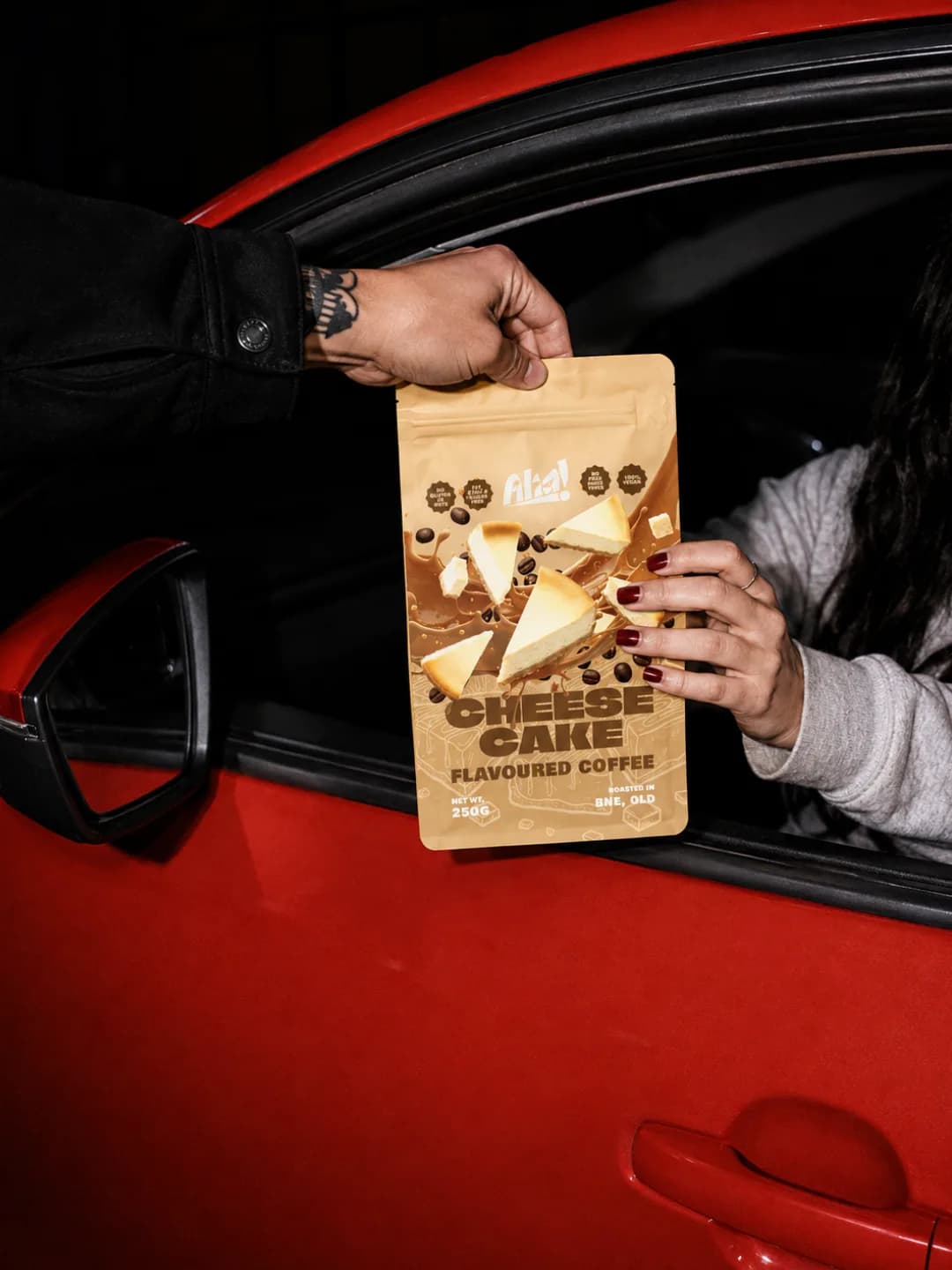
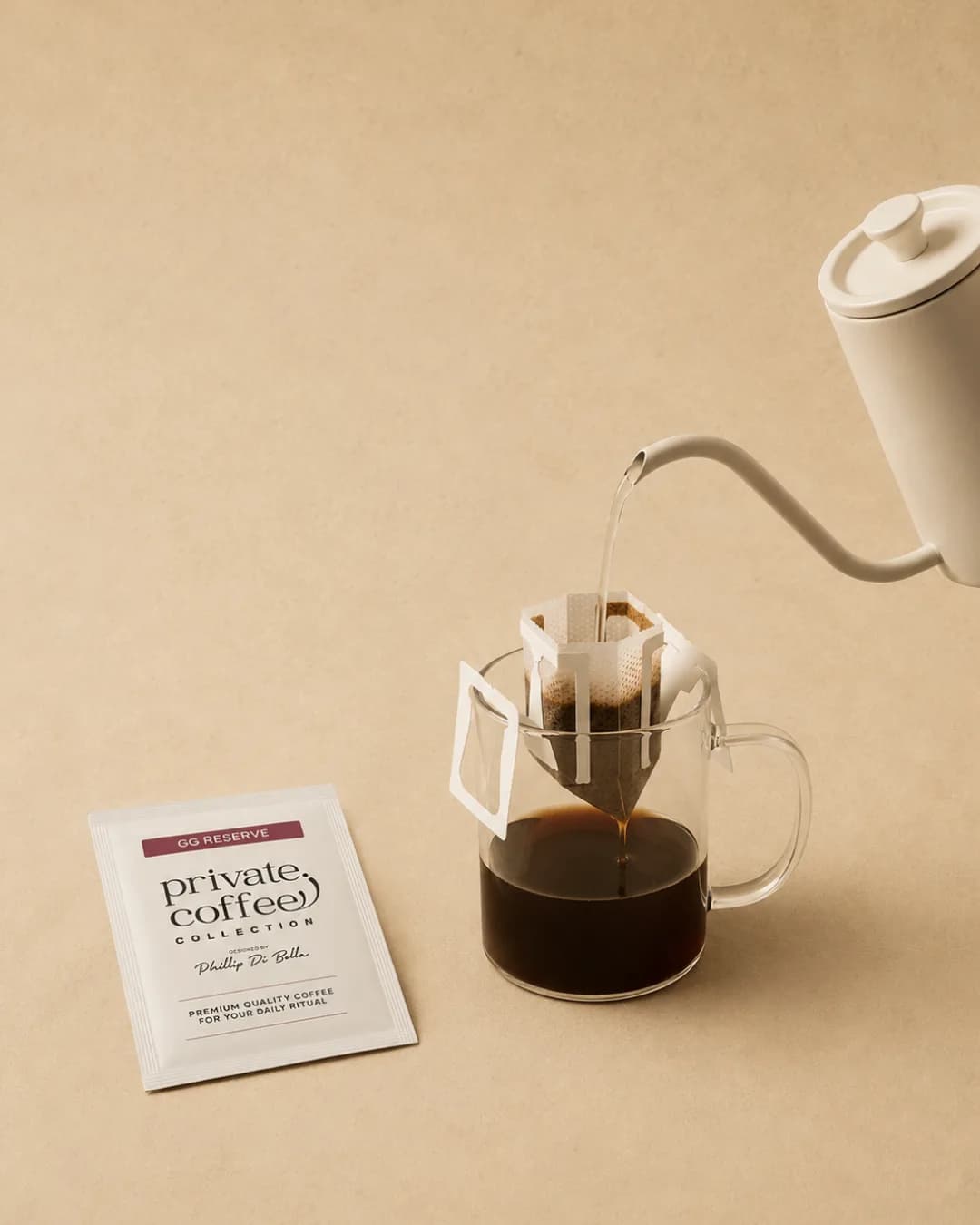
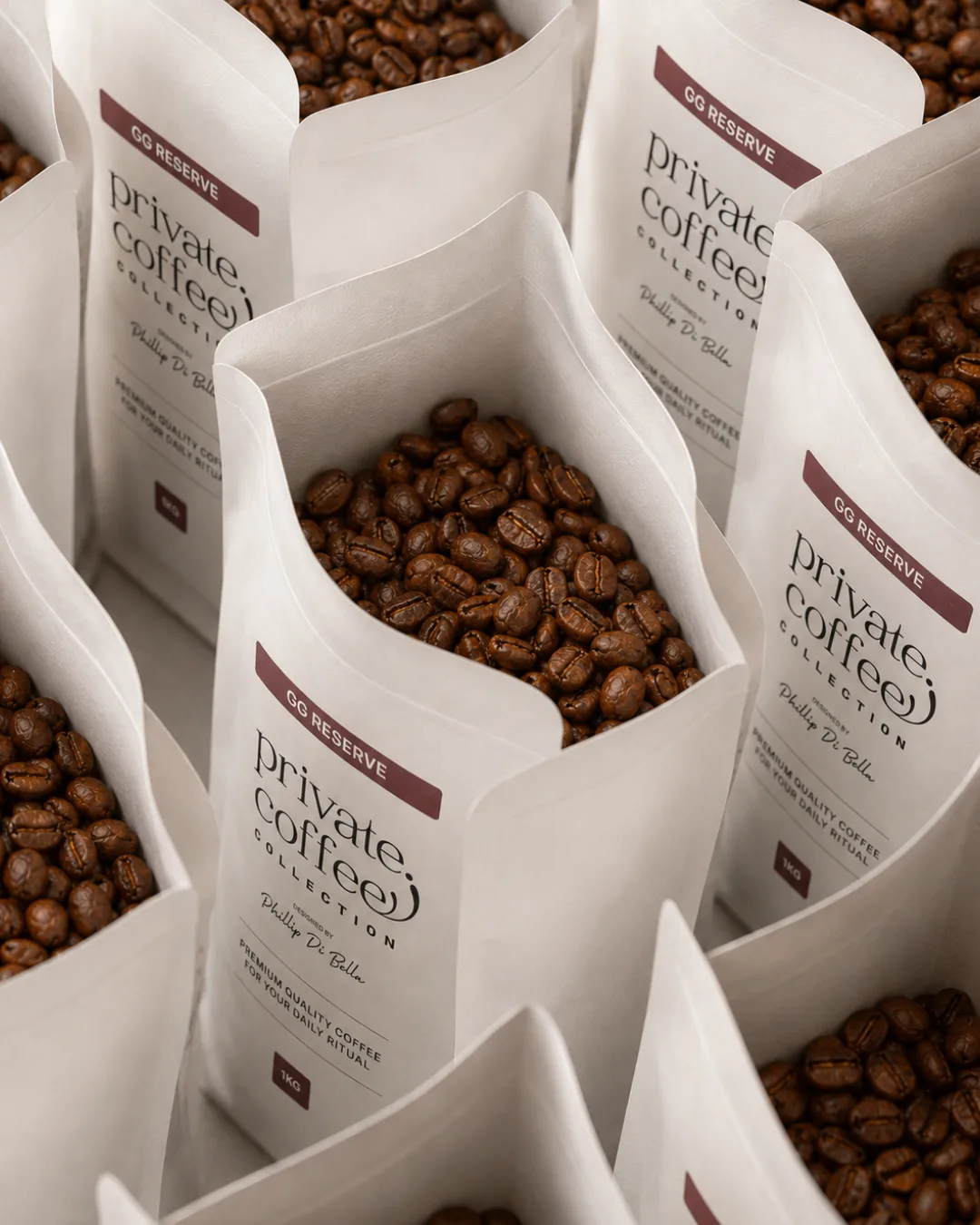
You do not need an expensive shoot, but you do need care. Soft, flattering light. Simple, uncluttered backgrounds. Consistent styling and colour. A few considered shots beat a phone roll of busy, mismatched ones. Avoid obvious stock imagery entirely; nothing reads as generic faster.
Editorial thinking
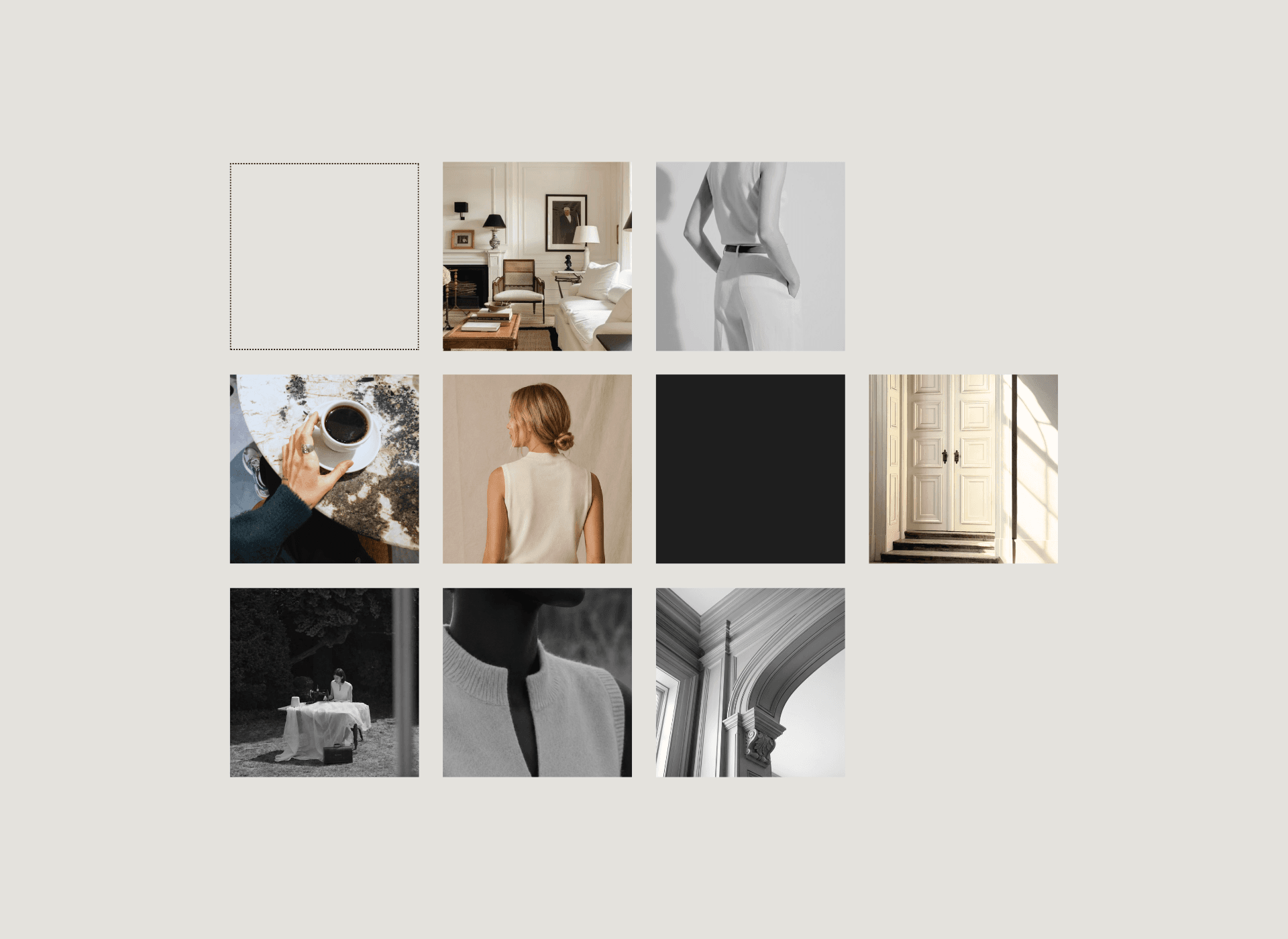
Premium brands treat their feed like a publication, not a sales channel. Each post has a job, the pillars are consistent, and the whole grid looks considered when you step back. Think in terms of a magazine with a point of view, where design and words work together, rather than a stream of disconnected posts.
Copy that matches the visuals
A premium look with hyped-up, exclamation-heavy captions is a mismatch people feel instantly. Your words carry as much of the perception as your images. Calm, confident, specific copy, free of hard-sell language and emoji clutter, is what makes a brand sound as considered as it looks.
From our studio: If building this system yourself feels like a lot, our design template packs give you a ready-made premium look: a set of on-brand, editable templates (Canva, Figma, or PSD) with a defined palette, typography, and layouts, so your feed stays consistent even when you are posting it yourself. See the template packs →
What changes if you sell a service, not a product
The fundamentals above hold whether you sell a serum or a service. But if you run a wellness studio, a clinic, a coaching practice, or any service business, some of the levers shift. What you are making look premium is not packaging on a shelf; it is an experience and a relationship.
- Photograph the space and the people. Your product is the room, the treatment, the practitioner. Clean, well-lit images of your space, your hands at work, and real clients do the job that packaging shots do for a product brand.
- Lead with results and testimonials. Outcomes, before-and-afters, and client words are your proof. Presented consistently and tastefully, they signal quality the way a product review does.
- Make the founder part of the brand. Services are personal. A consistent, considered founder presence, a face, a voice, a point of view, often carries more weight than any graphic.
- Show the client experience. The booking, the welcome, the small details of a session. Premium service brands sell the feeling of being looked after, so let people see it.
- Keep the tone calm and expert. Authority with warmth. Hard-sell and discount-led language cheapens a premium service faster than anything.
The system does not change: a tight palette, consistent photography, editorial thinking, and calm, confident copy. Only the subject does, an experience and a person rather than an object.
Quick wins versus long-term work
Some of this you can fix this week. Some is a deeper build.
Fix this week
Build over time
Pick two or three brand colours and one or two fonts, then use only those everywhere
A full brand and content system, with your palette, type, and templates documented in one place
Tidy your bio and highlight covers so the promise is clear within three seconds
A defined visual world and a photography style that is unmistakably yours
Delete or archive the off-brand posts dragging your grid down
A cohesive, editorial grid that looks planned when someone views the whole profile
Add breathing room to your graphics and trim your captions to the essentials
A repeatable content and shoot process, so consistency does not rely on willpower
Cut the exclamation marks, capitals, and hard-sell language
A tone of voice that is genuinely yours: calm, confident, and consistent
Start with the quick wins. They cost nothing and the perception shift is immediate.
What premium does not mean
A warning, because this is where brands overcorrect. Premium is not cold, and it is not boring. Stripping out all personality in the name of minimalism produces something sterile that nobody connects with. The most desirable premium brands still have warmth, a point of view, and a human voice; they are considered, not clinical.
Premium is restraint with feeling. Keep the personality. Just express it consistently, and with taste.
Common mistakes that make you look cheap
- Too many fonts and colours. The fastest way to look amateur. Pick a system and hold it.
- Cluttered, text-heavy graphics. Crowding signals cheapness. Add space.
- Inconsistent photography. Mixed light, styles, and filters break the spell. Choose one look.
- Obvious stock imagery. Reads as generic and impersonal. Use real, styled photography.
- Hype-heavy captions. Exclamation marks and capitals undercut a premium look. Write calm and specific.
- A disjointed grid. Every post beautiful in isolation, chaotic together. Plan the whole.
FAQ
How can a small brand look premium on a small budget?
Focus on consistency, not spend. A tight colour palette, one or two fonts, considered phone photography with good light, plenty of space, and calm, confident copy will look more premium than an expensive but inconsistent feed.
What makes a brand look expensive on Instagram?
Restraint and consistency. A coherent palette and type system, uncluttered photography, an editorial grid, and a calm tone of voice. The brain reads consistency as quality.
Do I need professional photography to look premium?
Not necessarily. Good light, simple styling, and consistency matter more than expensive equipment. A few considered shots beat many busy, mismatched ones. Avoid obvious stock imagery.
Why does my feed look cheap even though my product is good?
Almost always inconsistency: too many fonts, colours, and photo styles, plus cluttered graphics and hype-driven copy. Fixing the system, not the budget, is what closes the gap.
Does looking premium actually affect sales?
Yes. Consistent, premium presentation is linked to higher trust and a willingness to pay more, since your social is often the deciding first impression before someone judges whether you are worth the price.
Does this apply to service businesses, not just product brands?
Yes. The levers shift slightly, photograph your space, people, and results rather than packaging, and lean on the founder and the client experience, but the fundamentals are identical: consistency, restraint, editorial thinking, and calm, confident copy.
The bottom line
Looking premium is not a budget problem. It is a consistency problem. Your product may be worth every penny, but if your feed is cluttered and inconsistent, it quietly tells people otherwise. Pick a palette and a couple of fonts, give your content room to breathe, shoot with care, think like a publication, and write with calm confidence. Then hold it, everywhere, every time.
Do that and your social stops undercutting your price and starts earning it, turning a first impression into a reason to buy.
Want your brand to look as good as it is?
KURAE builds premium, editorial content for founders who have taste but not time, treating every brand like a publication worth protecting. Strategy, content, and management as one system, for premium beauty, wellness, fashion, and food brands anywhere, from the UK and Europe to the US and Australia.
If your feed is not doing your product justice, read the KURAE story, see the services and pricing, or start the questionnaire and we will shape a plan that actually feels like you.